Hello, I’m Fraser.
-
I’m a Communication Design graduate from Gray’s School of Art, recently back in Scotland after three years living and working in Australia. Over that time my work has increasingly moved between graphic design, photography, film and content creation, and I’m now looking to bring those skills back into an agency environment.
I’ve put this portfolio together specifically to show the range of work I could bring to Mearns & Gill, from branding, campaign and editorial design to photography, video and motion. I enjoy developing strong visual ideas, experimenting across different mediums and adapting my approach to suit the brief.
I’d love the opportunity to contribute to the team, keep developing as a designer and bring my wider experience in image-making and visual storytelling into the role.
-
First-Class BA (Hons) Communication Design graduate from RGU
Skilled in Photoshop, Illustrator, InDesign, After Effects, Premiere Pro and DaVinci Resolve, with a strong understanding of typography, layout, image-making and visual storytelling.
I have extensive hands-on camera experience across photography and video. I’m confident shooting events, portraits, promotional content and fast-moving real-world situations, with experience directing people, working in changing light and capturing content independently from concept through to final edit.
-
I’ve recently returned to Aberdeen after several years away and want to build the next stage of my creative career here. Mearns & Gill really stands out to me because of its legacy. With almost 90 years in Aberdeen, evolving from old school advertising into a fully integrated creative agency while maintaining a strong reputation for award-winning work.
I’d love to contribute to an agency with such deep roots in the city and play a part in the next chapter of Aberdeen’s creative scene.
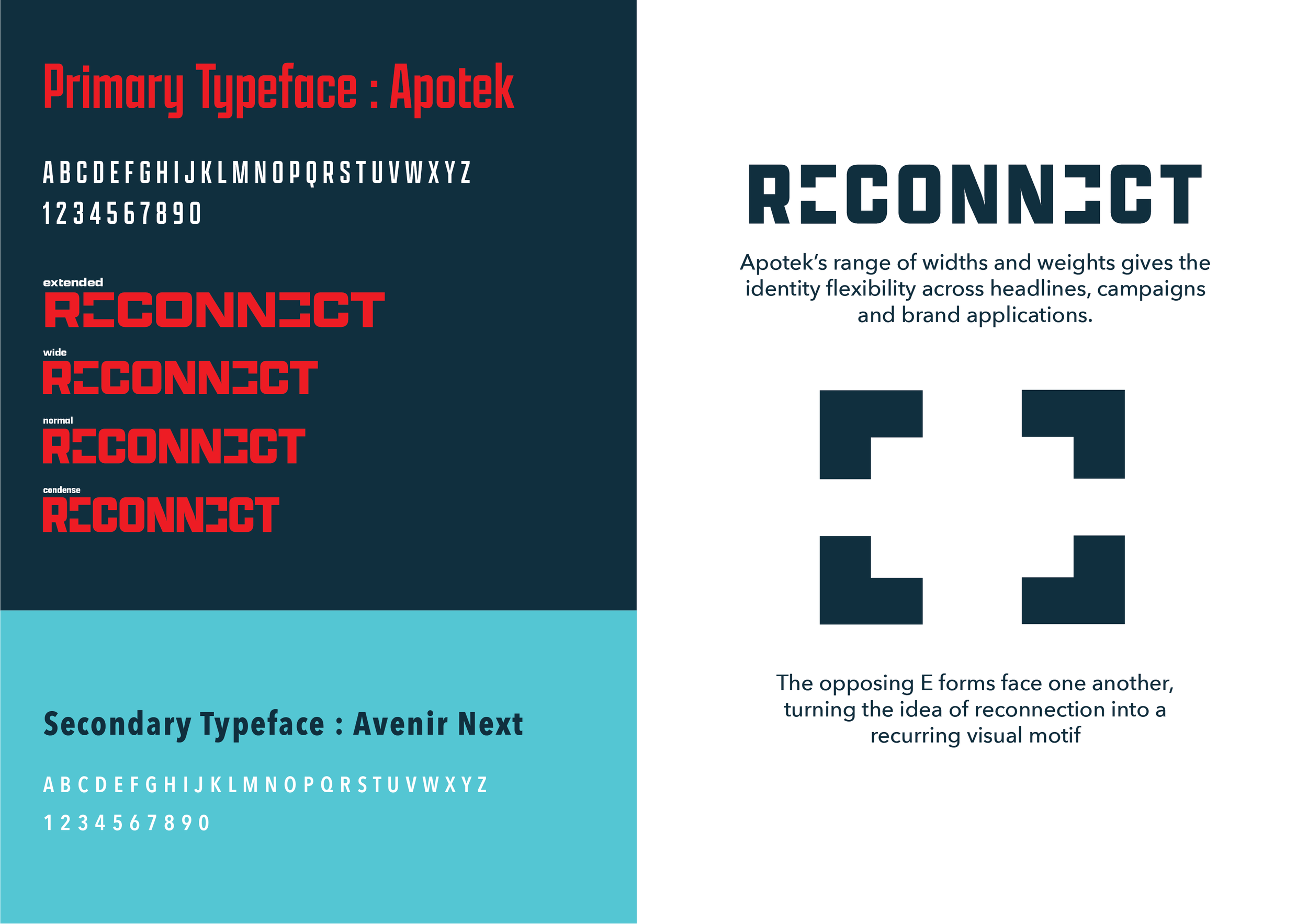
RECONNECT is an awareness campaign inspired by Netflix’s documentary ‘The Social Dilemma’. Using stark images and bold typography, the campaign explores the impact of social media on mental health, behaviour and human connection.
Conceptual Client : Center for Humane Technology
Discipline : Branding / Campaign / Art Direction
Project Type : Self-Directed Concept
Initial Logo Concept.
Final Logo Concept.
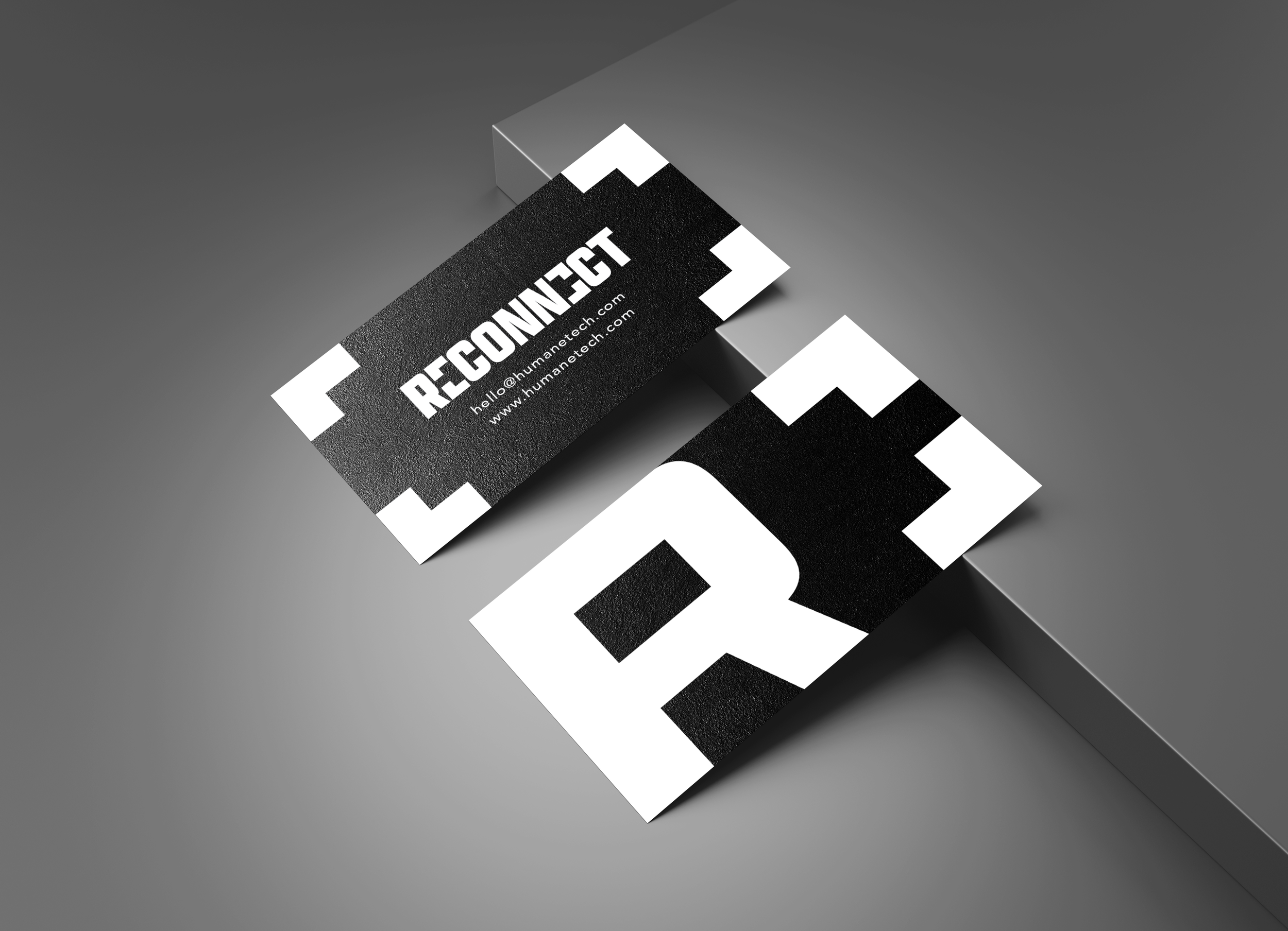
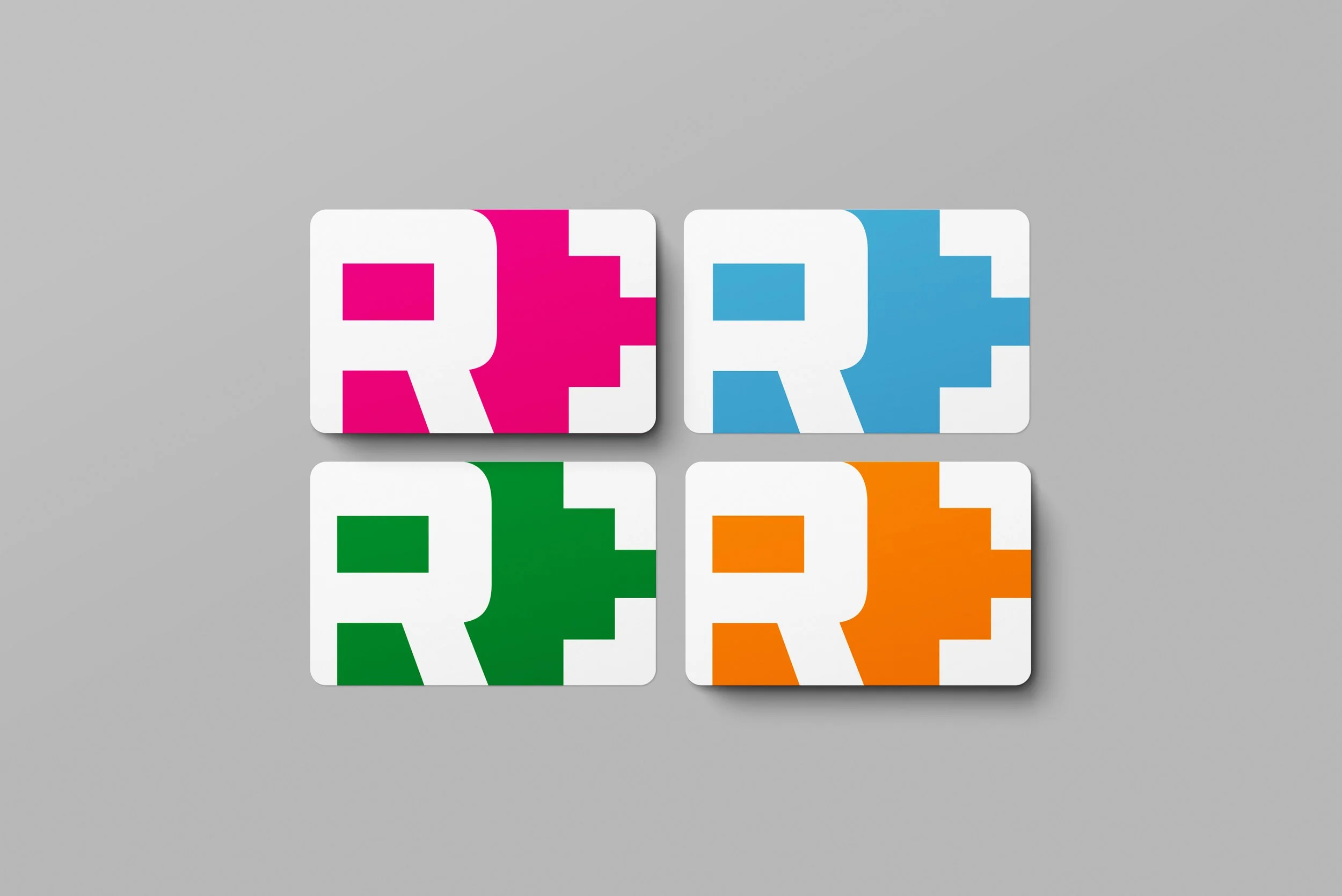
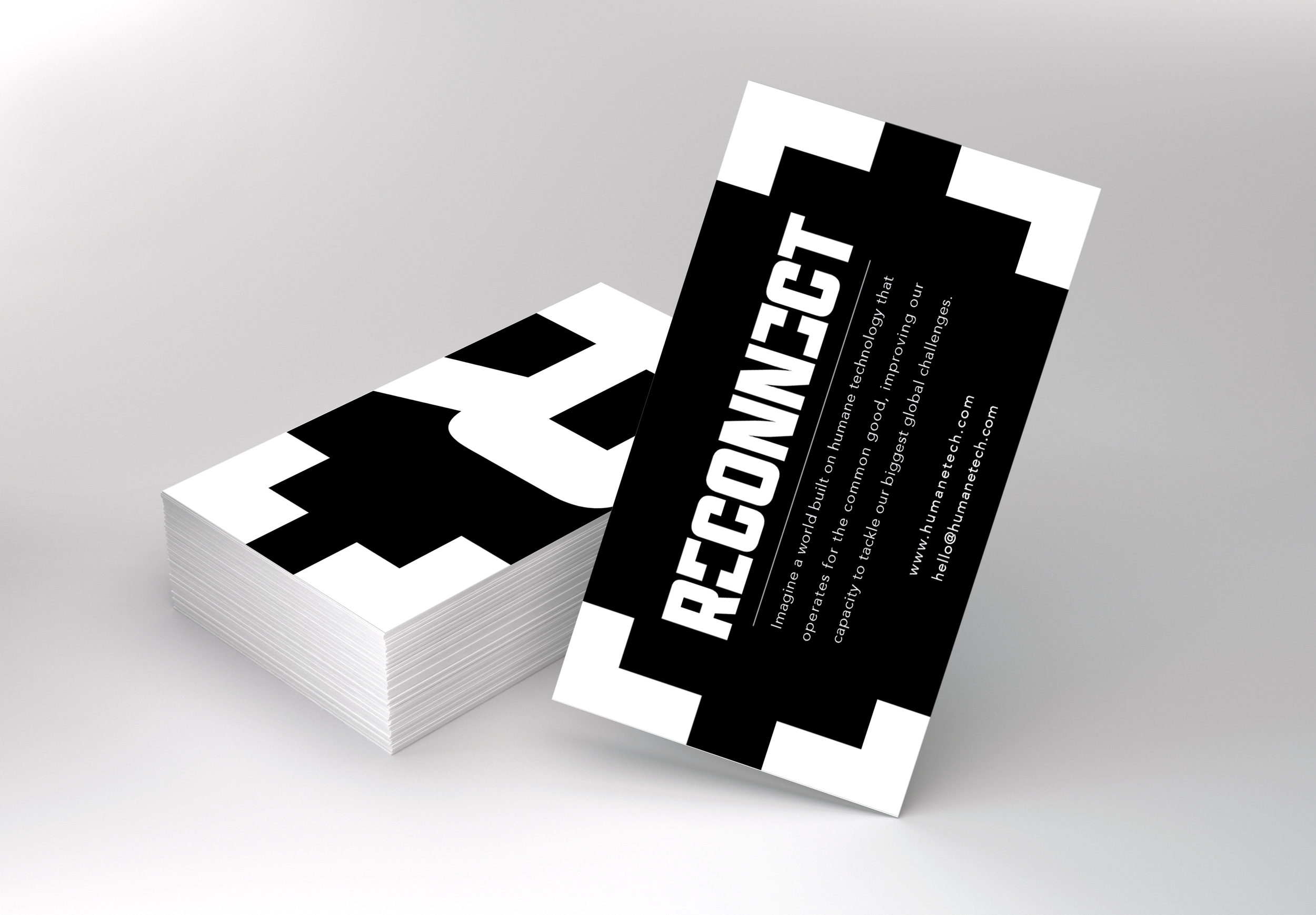
Poster Mockups.
The challenge was balancing a serious message with a visual approach that felt bold rather than preachy. I focused on simple metaphors, strong typography and minimal copy to make the campaign immediate, memorable and easy to read.
Final Poster Concepts. Designed 23/09/2026
CLUB NIGHT SERIES.
SMART CASUAL is a club night founded by Al Mckay (Et Al) and Dan Leggett (Test Press). An electronic club night revolving around, loose dress codes and not taking yourself too seriously. The identity plays on that contrast. Formal enough to feel intentional, but still loud, playful and a bit messy.
Client : Smart Casual
Discipline : Branding / Campaign / Art Direction
Project Type : Music Promotion
Each event needed its own visual identity without losing the character of Smart Casual. Over time, the recurring shoe became the real brand device — allowing the posters to constantly change in style, colour and composition while still belonging to the same club night.
Exceed LinkedIn Banner Advert.
LinkedIn banner ad for Exceed, designed around a client testimonial to highlight reliability, expertise and support.
Client : Exceed MPR
Discipline : Motion Graphics
Project Type : Social Banner
Stag’s Breath Social Advert.
Promotional social graphic inviting customers to submit their own summer cocktail recipe, using bold typography and hand-drawn details to keep the campaign playful and approachable.
Client : Stag’s Breath
Discipline : Motion Graphics
Project Type : Web Ad
Fierce Beer Trailer.
Short commercial for the Edinburgh Film Festival. Using punchy typography and movement to match the brand’s gritty aesthetic.
Client : Fierce
Discipline : Motion Graphics
Project Type : Film Trailer
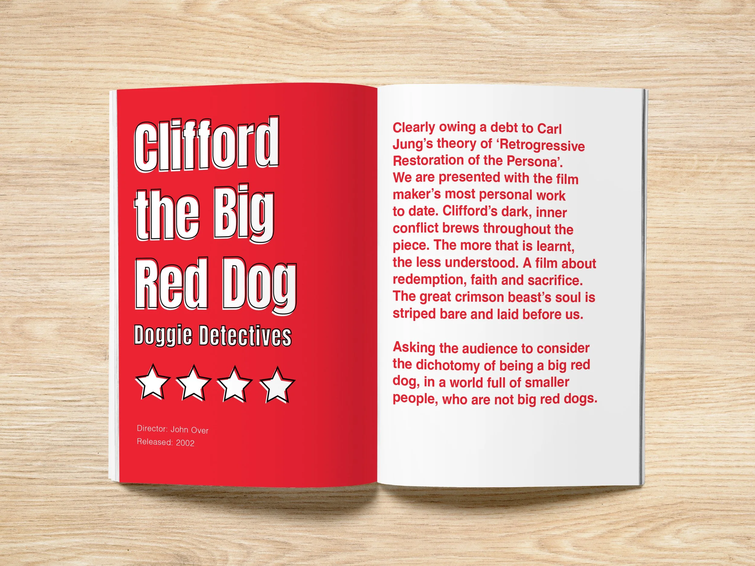
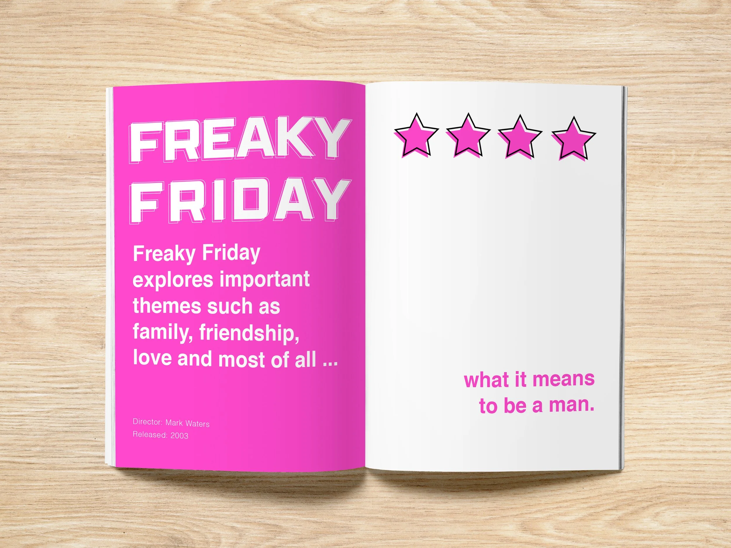
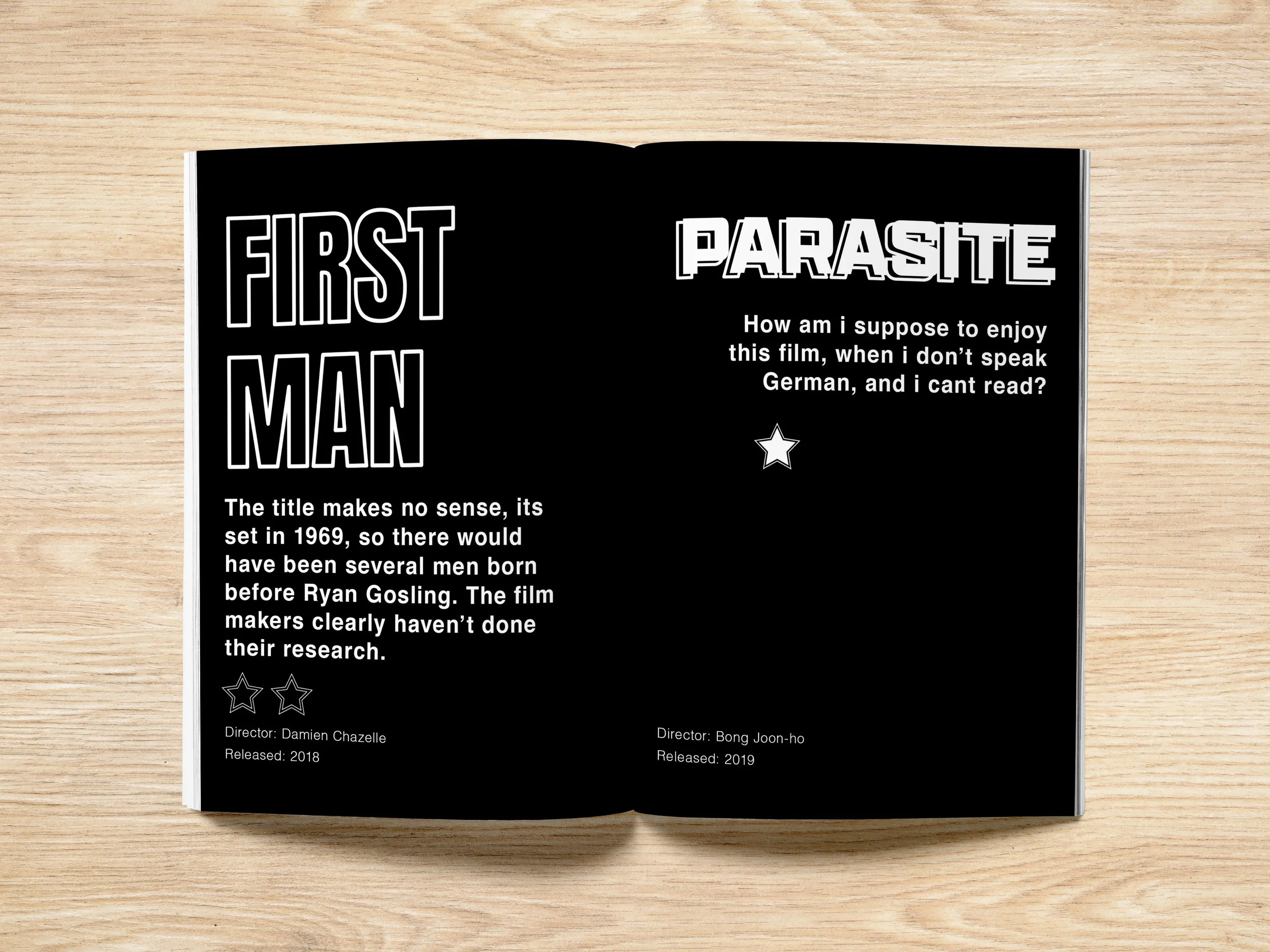
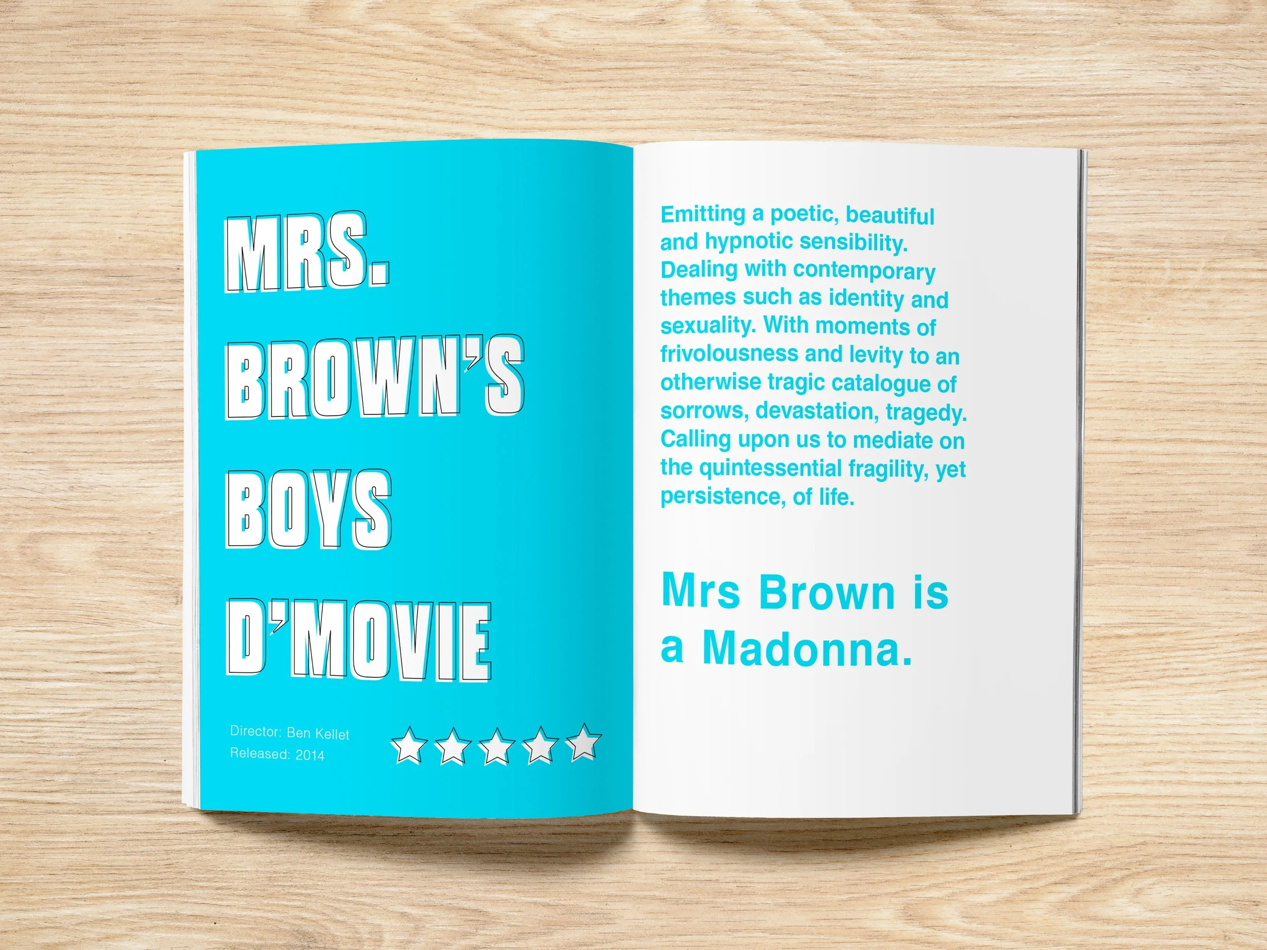
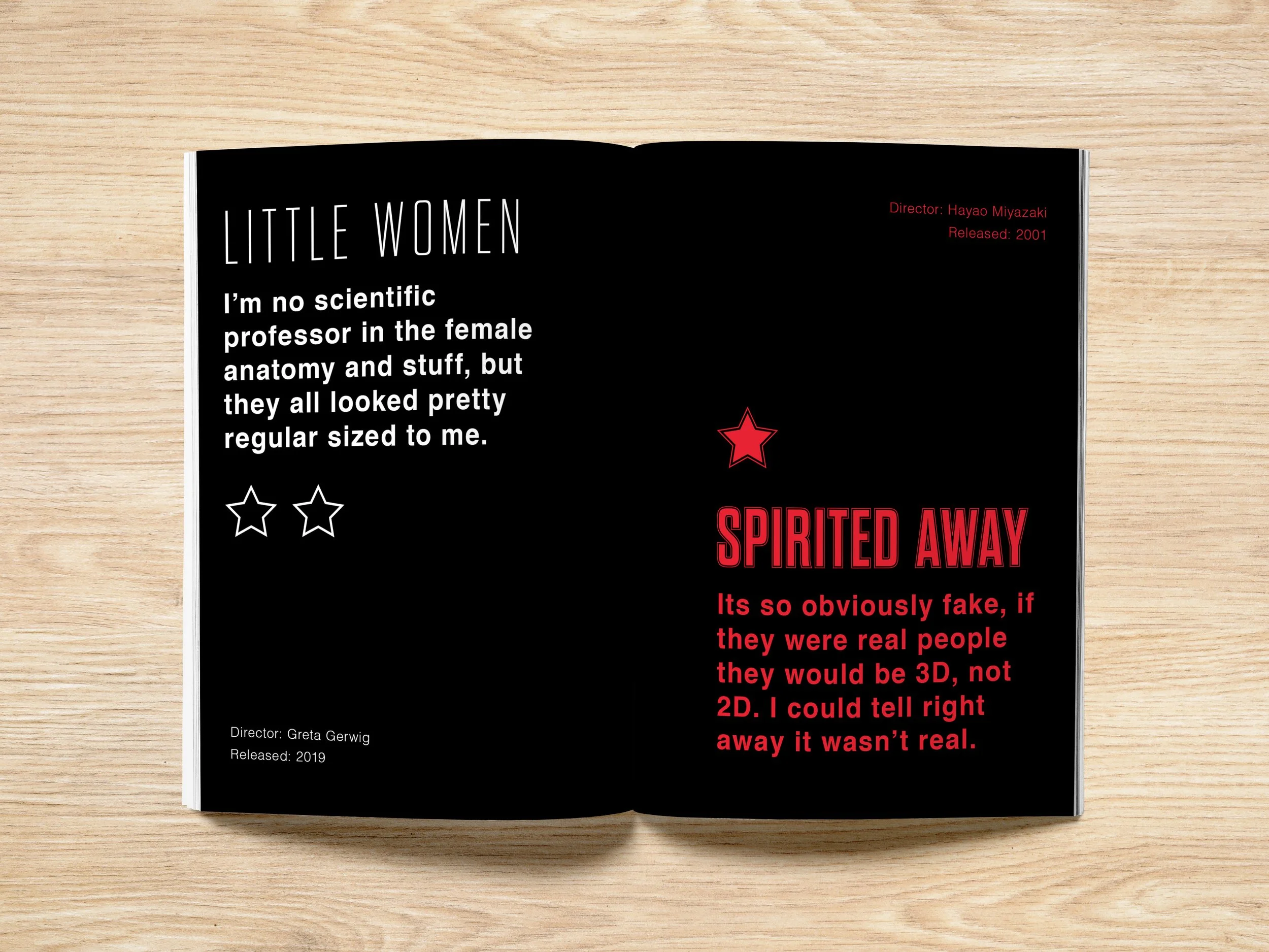
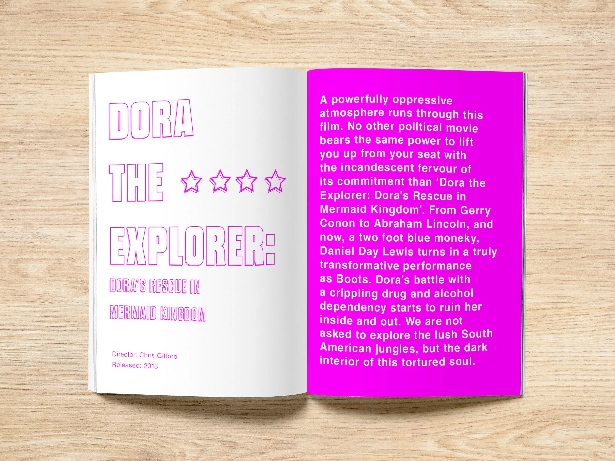
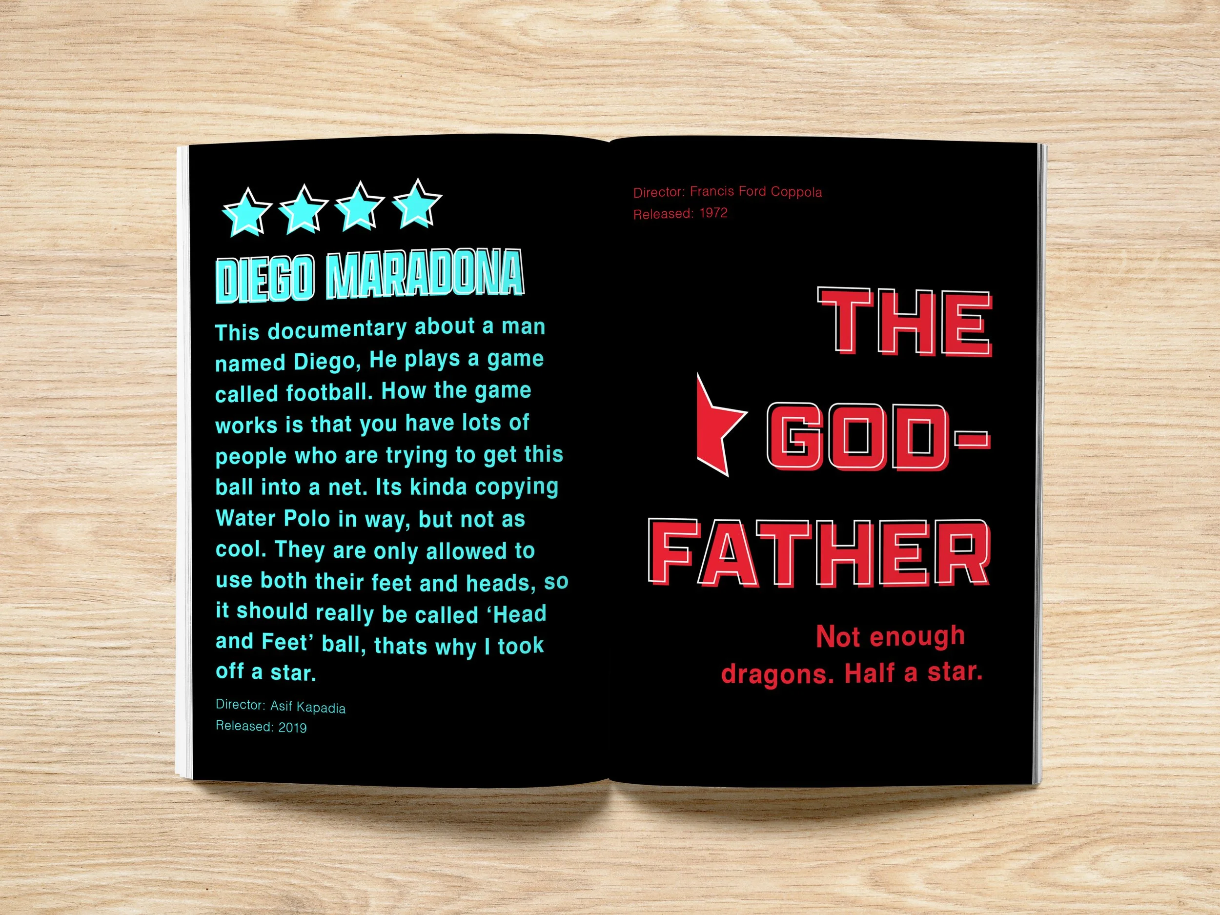
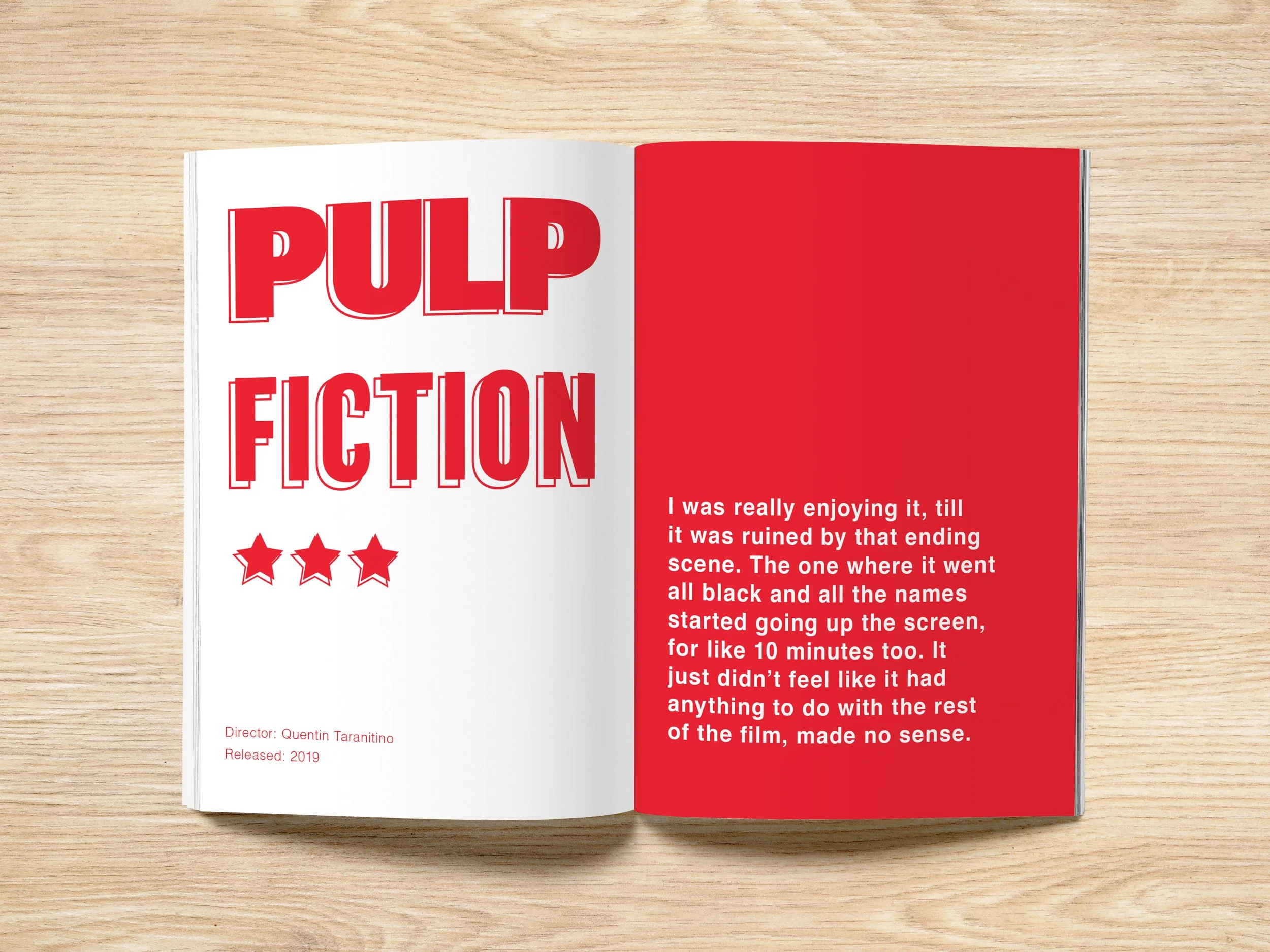
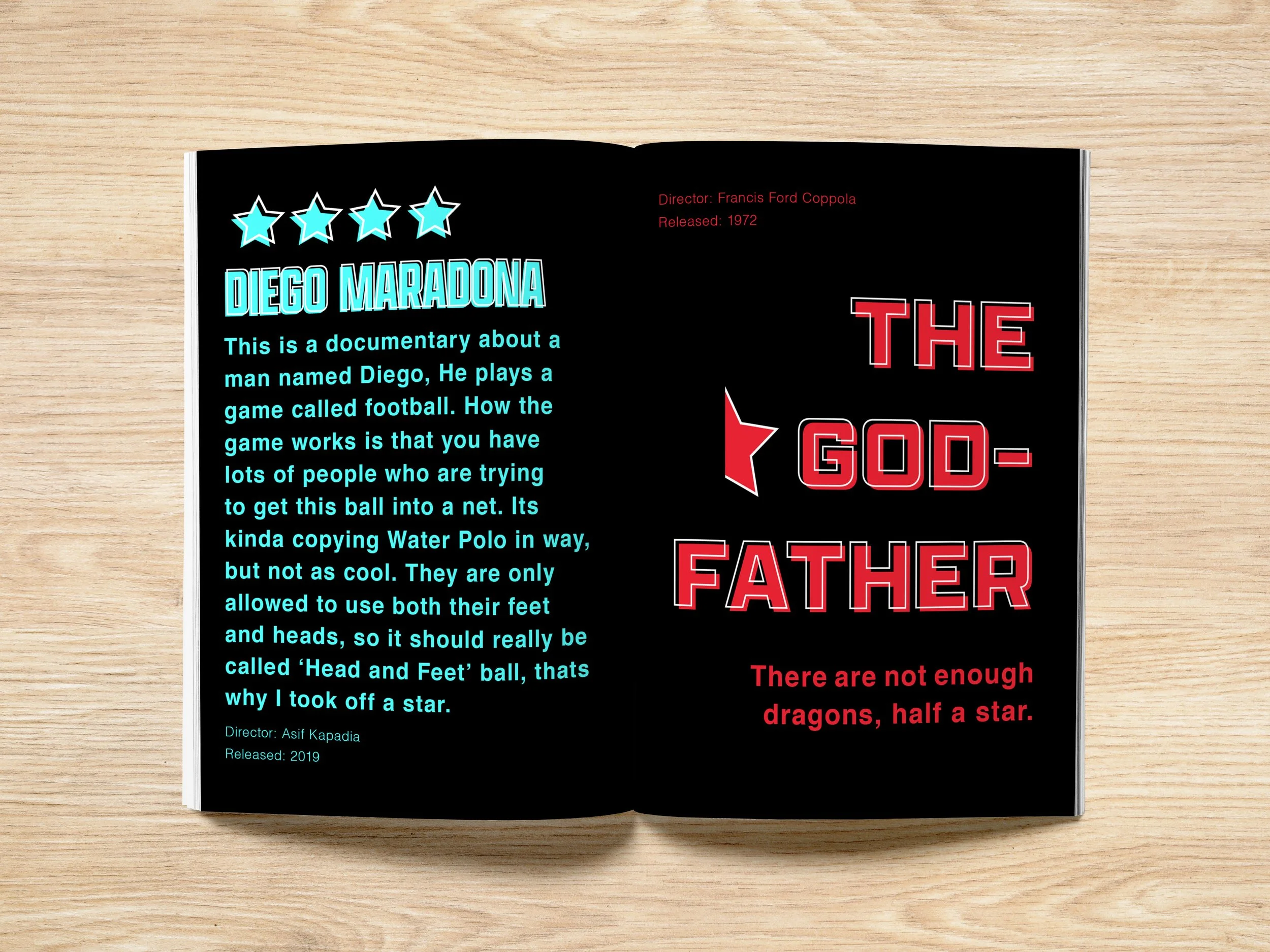
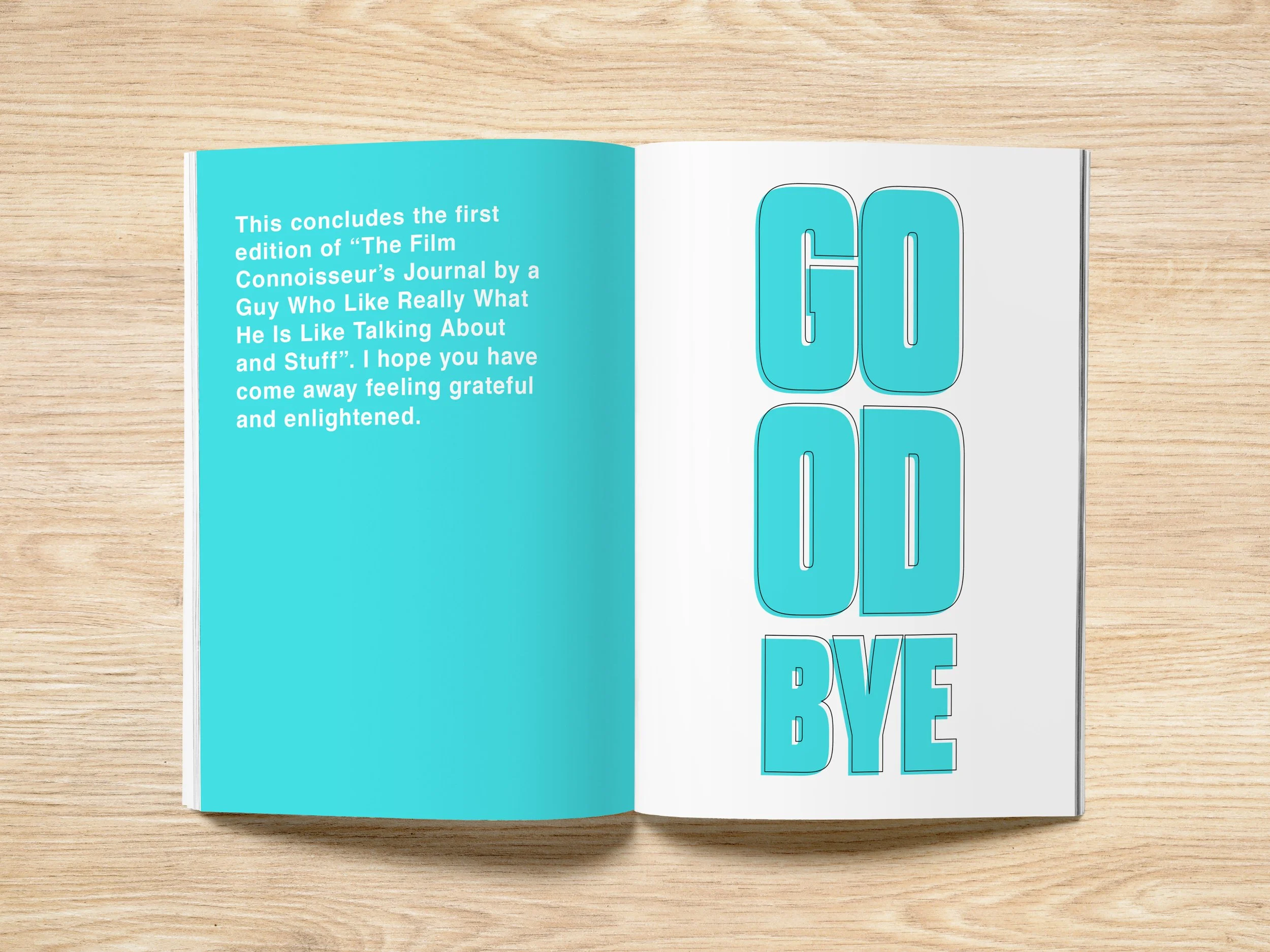
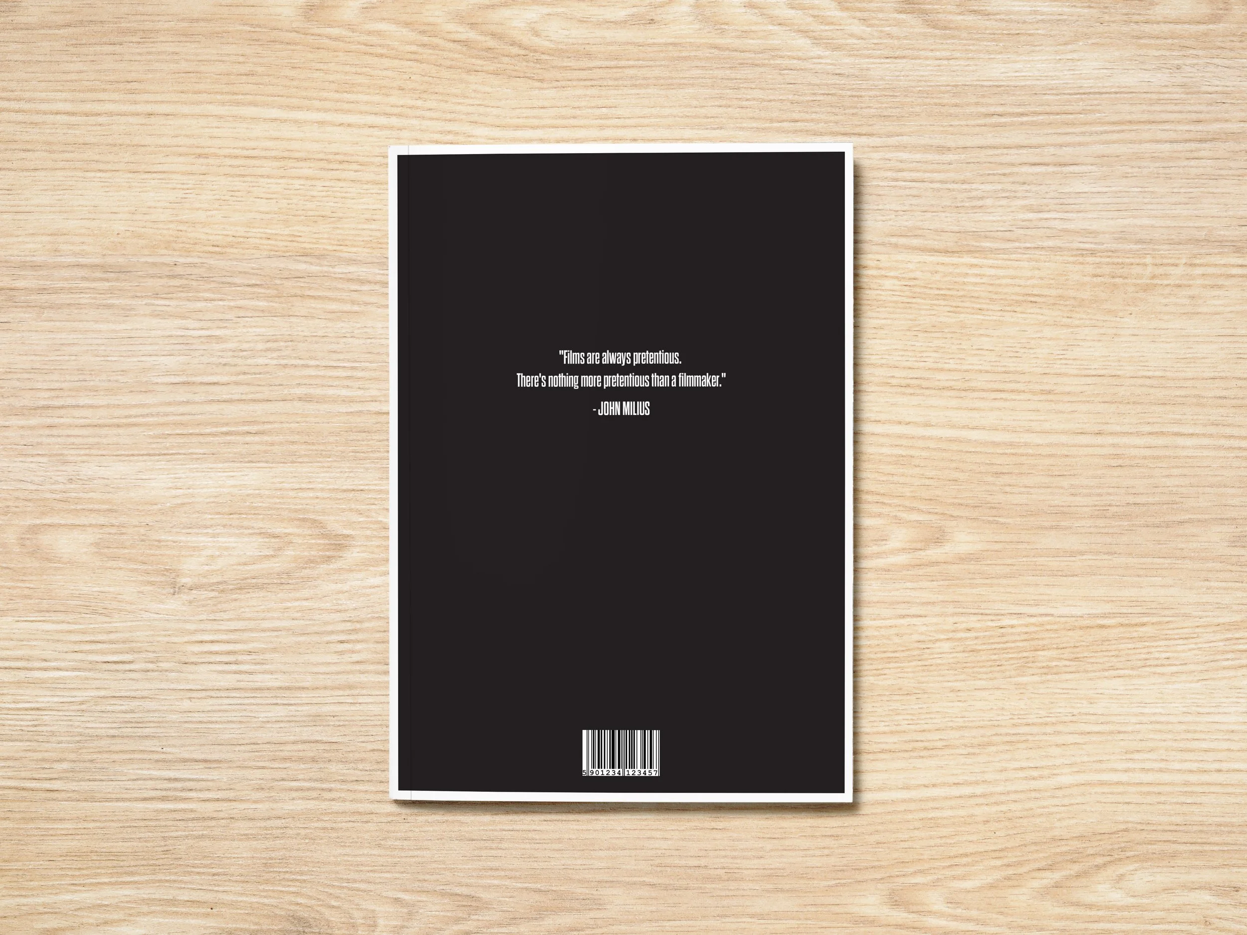
Comedic Film Journal.
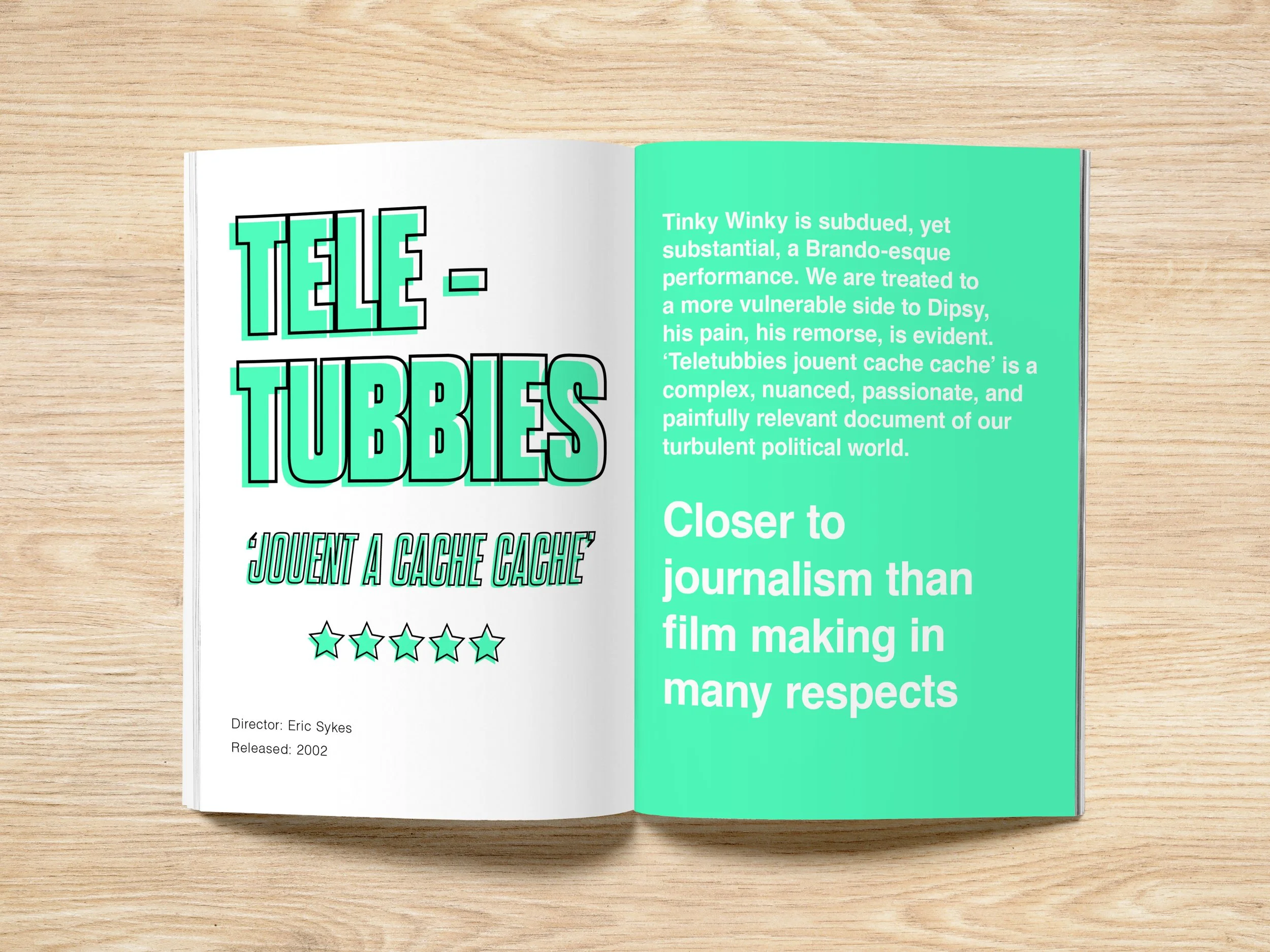
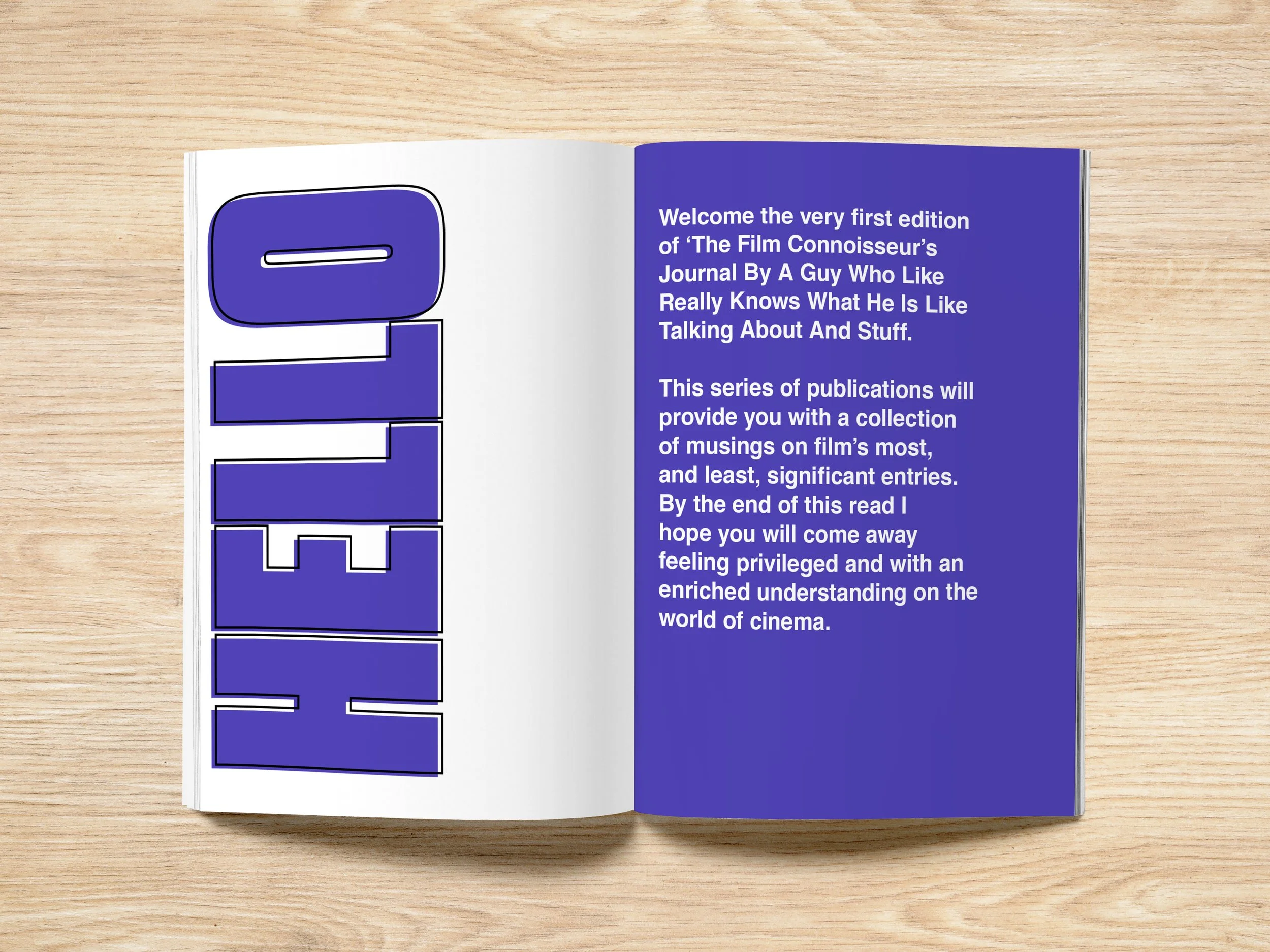
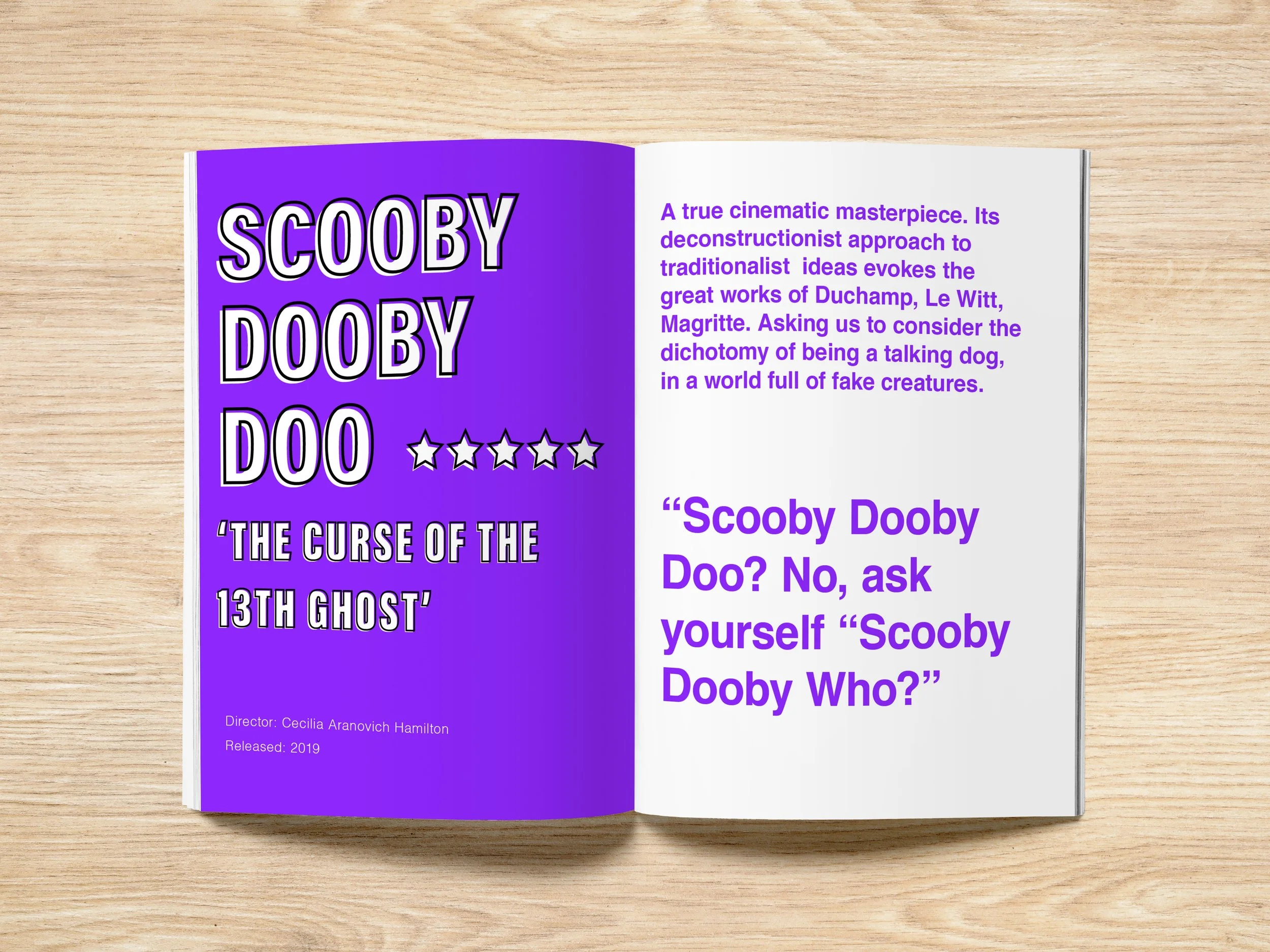
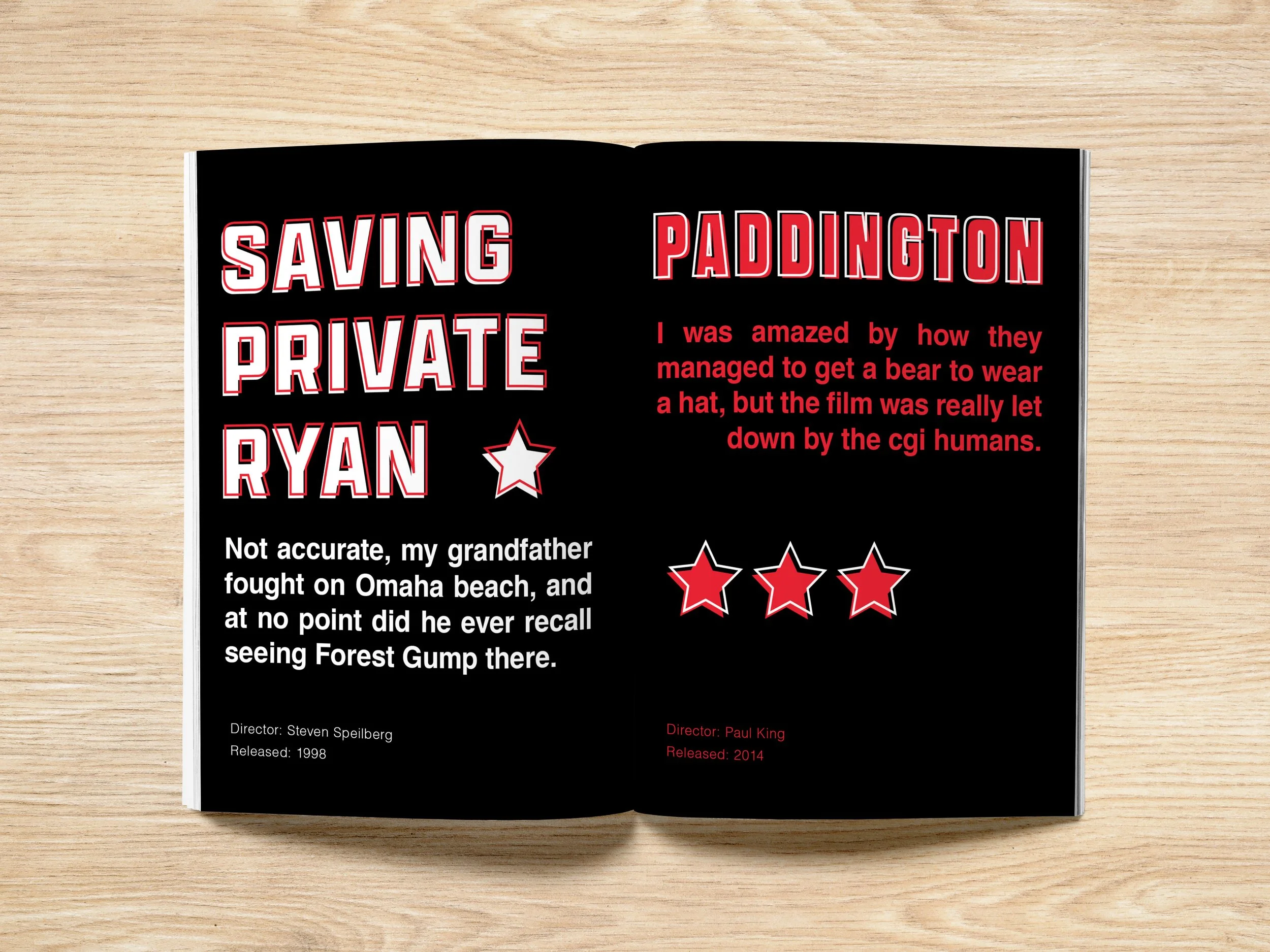
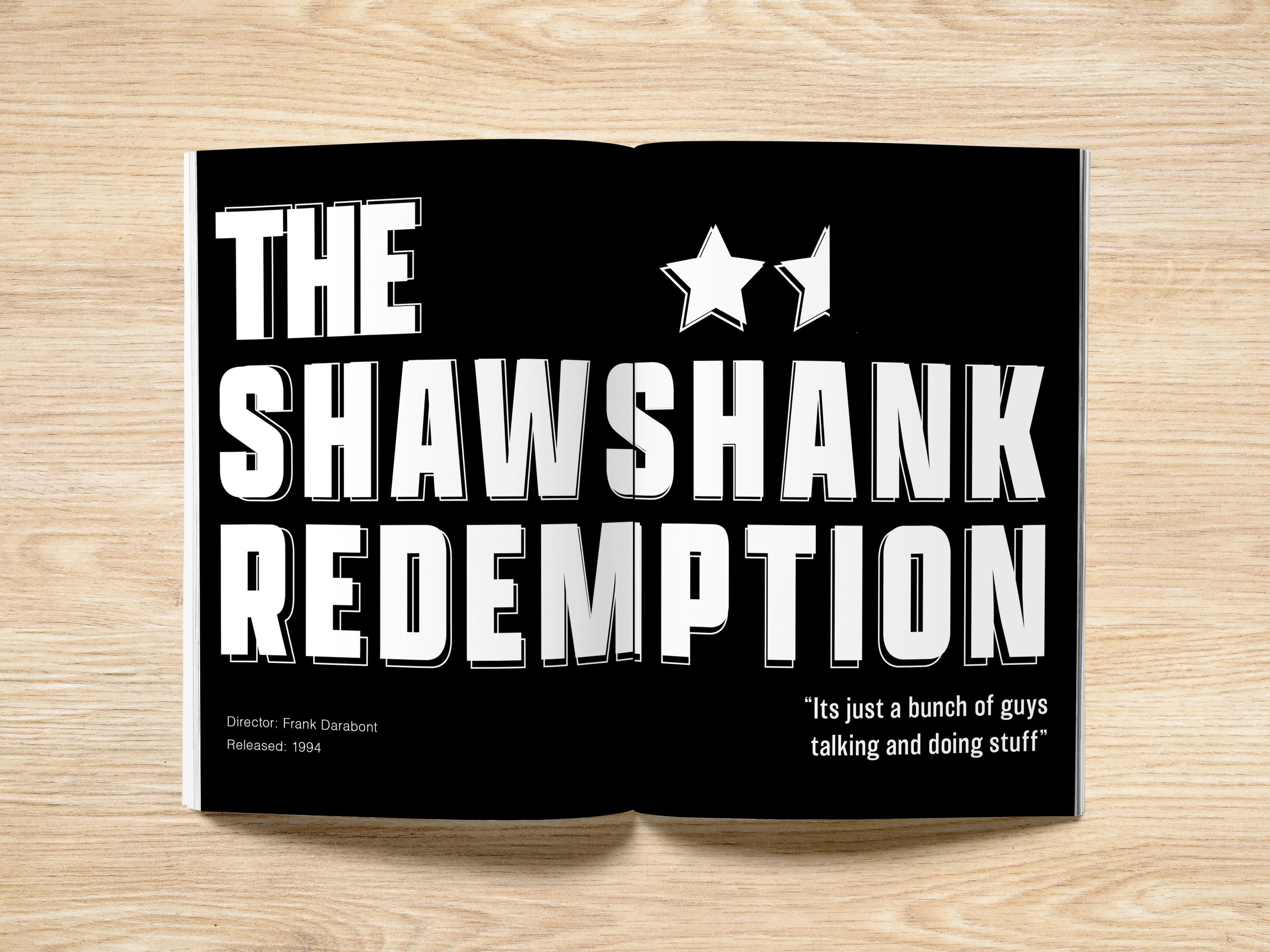
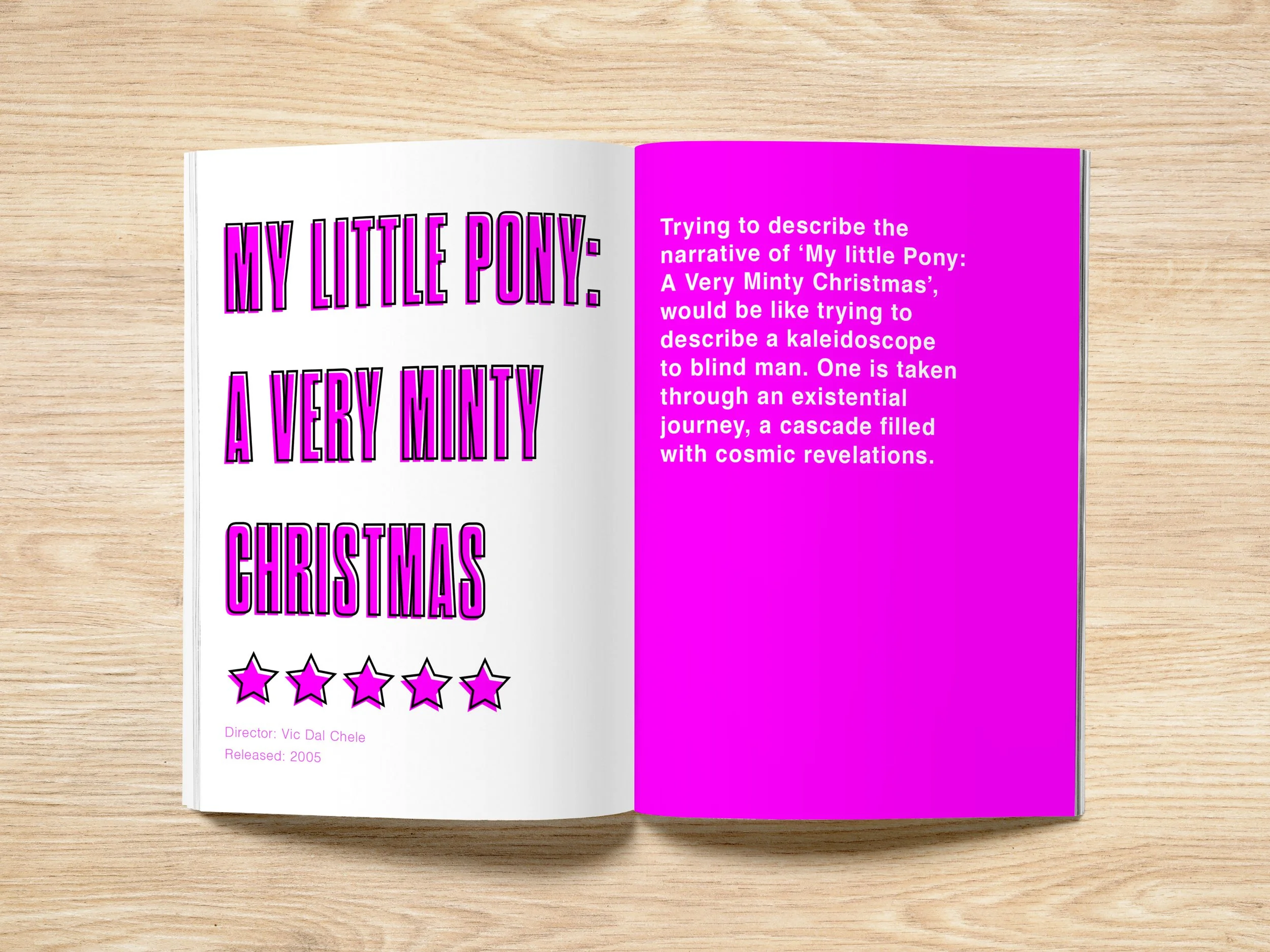
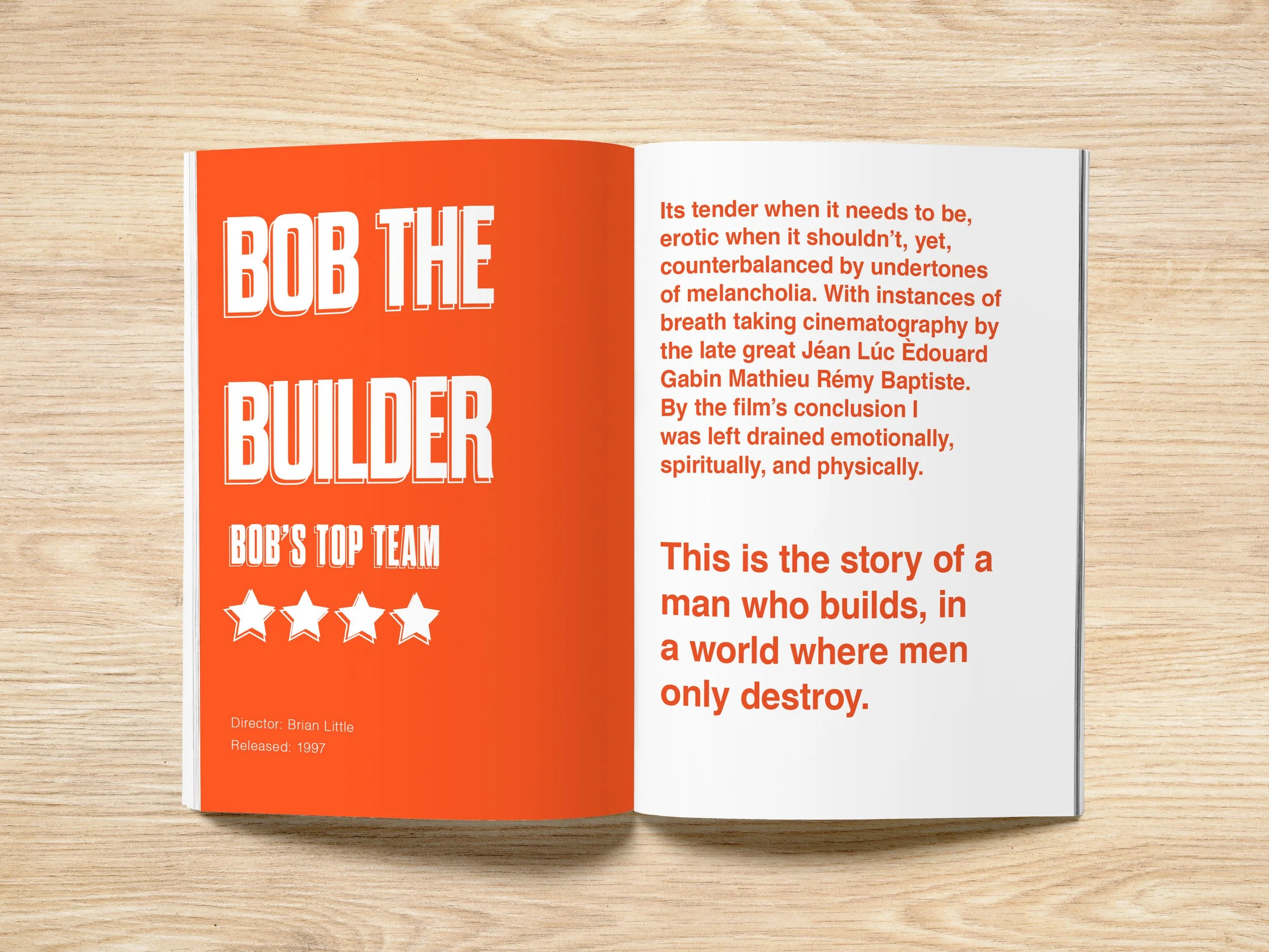
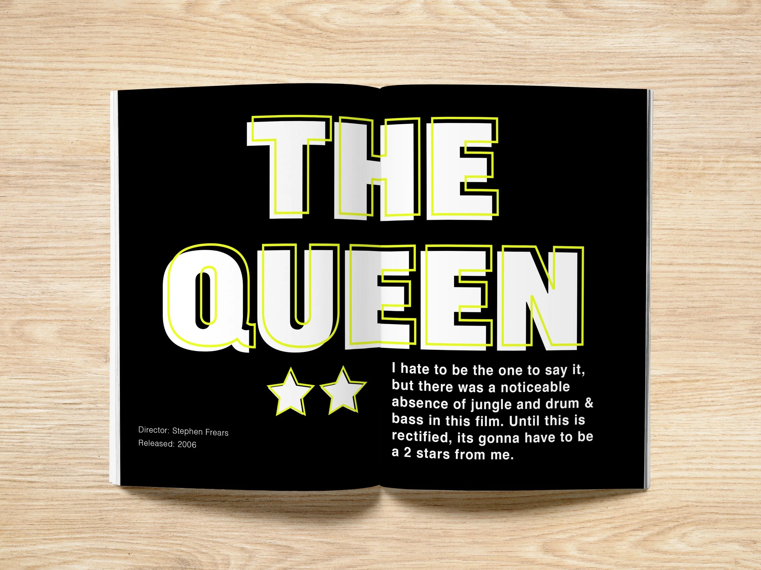
For this brief I created an absurdist comedy editorial, this was inspired by publications like The Onion and Private Eye. The idea was born from surrealist film critiques I had been posting on my Letterbox’d account, which I then developed into a full editorial.
Client : Me
Discipline : Editorial, Typography
Project Type : Magazine
The cover uses oversized typography and a shifting colour palette to establish the journal’s playful, absurd tone from the outset. The hourglass shaped title accentuates the comically long name of the magazine.
I borrowed a visual device from The Onion, using an oversized setup followed by a much smaller punchline to make the typography itself part of the joke. This becomes a recurring visual motif throughout the book, highlighting how design and content can become one.
Thank You!
I hope you’ve enjoyed my design portfolio.
You can also explore my photography and videography work, which forms another key part of my creative practice.